What Does Purple and Pink Make? Color Mixing Explained
 Christopher Snyder
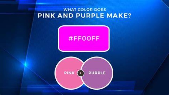
Mix purple and pink together, and you'll get a shade that falls somewhere between deep magenta and soft fuchsia. The exact result depends on your mixing method, the specific shades you start with, and whether you're working with paint, light, or digital colors. This seemingly simple question opens up a fascinating world of color theory that artists, designers, and hobbyists navigate every day.
Understanding how these two colors interact requires a basic grasp of the color wheel and mixing principles. Purple sits between red and blue as a secondary color, while pink is essentially a tint of red—red mixed with white. When combined, they create colors in the red-violet family that range from vibrant to subdued depending on your ratios and starting materials.
The Science Behind Mixing Purple and Pink
Color mixing operates on different principles depending on your medium. Subtractive color mixing, used in paints and pigments, works differently than additive mixing with light. When you mix purple and pink paint, you're combining pigments that absorb certain wavelengths of light and reflect others back to your eye.
Purple contains both red and blue pigments. Pink brings additional red along with white. The result? You're essentially adding more red to your purple base while lightening it with the white component from pink. This pushes your final color further toward the red side of the spectrum while maintaining some of that purple depth.
The dominant color in your mixture depends entirely on proportions. A 50-50 mix typically produces a color similar to orchid or a brightened violet. Add more pink, and you'll drift toward rose or hot pink with purple undertones. Add more purple, and you'll get a deeper, more saturated violet-pink.
Common Results When Mixing Purple and Pink
The colors you can create from this combination span a beautiful range. Here are the most common outcomes:
- Magenta: A balanced mix often yields this vibrant purplish-pink that sits perfectly between the two parent colors
- Fuchsia: When pink dominates slightly, you get this electric, eye-catching shade popular in modern design
- Orchid: A more purple-heavy mix creates this elegant, softer purple-pink hybrid
- Mauve: Adding more white or using lighter starting shades produces this dusty, sophisticated tone
- Deep Rose: A darker pink with concentrated purple creates rich, dramatic results
Factors That Affect Your Final Color
Several variables influence what shade emerges from your purple and pink mixture. The starting shades matter immensely. Mix a cool-toned lavender with baby pink, and you'll get something completely different than combining deep violet with hot pink.
Paint types behave differently too. Watercolors blend and dilute more easily than acrylics. Oil paints offer rich pigmentation but require careful mixing. Digital color mixing in programs like Photoshop follows mathematical models that can produce cleaner results than physical pigments.
Lighting conditions change how we perceive the final color. A mixture that looks like soft mauve under warm indoor lighting might appear more violet under natural daylight. Professional artists and designers always check their colors under multiple light sources before committing to a final choice.
The undertones in your original colors play a crucial role. Purple with blue undertones creates cooler results. Purple with red undertones pushes toward warmer territory. Pink can lean coral, salmon, or true rose—each direction shifting your final outcome.
Practical Applications in Art and Design
Artists use purple-pink combinations constantly. These shades work beautifully in sunset paintings, floral compositions, and abstract pieces. The colors evoke emotions ranging from romance and femininity to creativity and sophistication.
Interior designers leverage these hues for accent walls, textiles, and decorative elements. A soft mauve brings calm elegance to bedrooms. Vibrant fuchsia adds energy to modern spaces. The versatility of purple-pink mixtures makes them valuable across design styles from minimalist to maximalist.
Fashion embraces these colors seasonally. Runway shows frequently feature variations of magenta, orchid, and rose. Makeup artists blend these tones for eyeshadows, blushes, and lip colors that flatter various skin tones.
Digital designers working on websites, apps, and graphics rely on precise purple-pink combinations for branding and user interfaces. These colors test well with audiences seeking both professional and approachable visual identities.
How to Mix Purple and Pink Successfully
Start with small amounts. You can always add more, but you can't subtract. Place equal portions of purple and pink on your palette, then mix thoroughly. Observe the result. Does it lean too pink? Add purple gradually. Too purple? Introduce more pink in small increments.
Keep notes if you're working on a project requiring color consistency. Record your ratios. "Two parts purple, one part pink" means something only if you remember which specific purples and pinks you used. Professional artists maintain color journals for exactly this reason.
Test your mixture on the actual surface where it'll appear. Colors look different on canvas versus paper versus fabric. What works on a smooth surface might read differently on texture. Always create swatches.
Consider creating a gradient. Mix several versions ranging from pure purple to pure pink with various ratios between. This shows the full spectrum of possibilities and helps you select the perfect shade for your needs.
Color Theory Context
Purple and pink both belong to the cool-to-warm color family, though their exact temperature depends on composition. This makes them naturally harmonious. They don't fight each other the way complementary colors might.
On the traditional color wheel, these colors sit relatively close. They're analogous, meaning they create pleasing, low-contrast combinations. This explains why their mixtures feel cohesive rather than jarring.
Understanding tertiary colors helps predict mixing outcomes. When you combine a secondary color (purple) with a tinted primary (pink), you're creating increasingly complex color relationships that can yield surprisingly sophisticated results.
Common Mistakes to Avoid
Don't use dirty brushes or palettes. Contamination from previous colors muddies your mixture. Clean tools produce pure, vibrant results.
Avoid mixing too vigorously with some mediums. Overworking oil paint can deaden the color. Overblending watercolor can create unintended granulation. Different materials require different techniques.
Never assume digital and physical mixing will match. RGB values on screen translate imperfectly to CMYK printing or paint mixing. Always test physical samples for critical projects.
Don't forget about opacity and transparency. Translucent layers behave differently than opaque applications. Glazing techniques in painting can produce colors impossible to achieve through direct mixing.
Frequently Asked Questions
What exact color do you get when mixing equal parts purple and pink?
An equal mixture of purple and pink typically produces magenta or a bright violet-pink. The exact shade varies based on which purple and pink you start with, but expect something vibrantly situated between the two parent colors with strong red undertones.
Can you make purple by mixing pink with another color?
You can create purple by mixing pink with blue. Since pink contains red and white, adding blue introduces the necessary blue component to form purple. The white content will lighten your purple, creating lavender or periwinkle shades rather than deep violet.
Does mixing purple and pink work the same way in all mediums?
No. Paint mixing uses subtractive color theory, combining pigments. Light mixing (like RGB displays) uses additive color theory, combining wavelengths. Digital color mixing follows mathematical models. Food coloring, fabric dyes, and cosmetics each have unique properties affecting results.
What colors complement purple-pink mixtures?
Yellow-greens and chartreuse provide vibrant contrast as complementary opposites. Soft neutrals like cream, taupe, and gray let purple-pink shades shine. Metallics, especially gold and rose gold, create elegant combinations. Navy and teal offer sophisticated contrast.
How do you lighten a purple-pink mixture that's too dark?
Add white gradually to lighten your mixture. Alternatively, add more pink since it already contains white. For watercolors, simply add more water. Be cautious—adding white can reduce saturation, creating chalky rather than vibrant light colors.
Final Thoughts
The question of what purple and pink make reveals the delightful complexity hidden in seemingly simple color interactions. Your results will range from electric magenta to soft mauve depending on countless variables. That's the beauty of working with color—there's no single correct answer, only infinite possibilities waiting to be explored.
Whether you're painting a canvas, designing a room, or just curious about color theory, understanding how purple and pink interact gives you another tool in your creative arsenal. Experiment freely. The worst that happens? You discover a shade you didn't expect. And sometimes those unexpected discoveries become your new favorites.
