Yellow and Blue: The Science, Psychology, and Magic of Two Powerful Colors
 Christopher Pierce
Yellow and blue stand as two of the most recognizable and powerful colors in human perception. They anchor opposite ends of the color spectrum's warm and cool zones, creating a natural tension that artists, designers, and nature itself have exploited for millennia. When placed side by side, these hues create one of the strongest visual contrasts available, a fact that explains their persistent appearance in everything from national flags to corporate logos to the paintings hanging in the world's greatest museums.
But the relationship between yellow and blue extends far beyond simple aesthetics. These colors carry deep psychological associations, trigger specific emotional responses, and play crucial roles in how we navigate and interpret the world around us. Understanding why this particular combination resonates so strongly requires examining color theory, human biology, cultural history, and the physics of light itself.
The Physics Behind Yellow and Blue
Light waves determine how we perceive color. Yellow light has a wavelength of approximately 570-590 nanometers, placing it in the middle of the visible spectrum. Blue occupies the shorter wavelength range of 450-495 nanometers. This difference in wavelength fundamentally shapes how these colors behave when they interact with surfaces, mix with other pigments, or appear in digital displays.
The human eye contains three types of cone cells, each sensitive to different wavelengths. Our "short" cones respond primarily to blue light, while "medium" and "long" cones handle green and red-yellow ranges respectively. This biological setup means yellow and blue activate distinctly different parts of our visual system, creating a clean perceptual separation that our brains process as highly contrasting.
When yellow and blue pigments mix physically—in paint, for instance—they produce green. This subtractive color mixing occurs because yellow pigment absorbs blue and violet wavelengths while reflecting green, yellow, orange, and red. Blue pigment absorbs red, orange, and yellow wavelengths while reflecting green, blue, and violet. The only wavelengths both reflect are in the green range, which is what our eyes see in the mixture.
Psychological Impact of Yellow and Blue Together
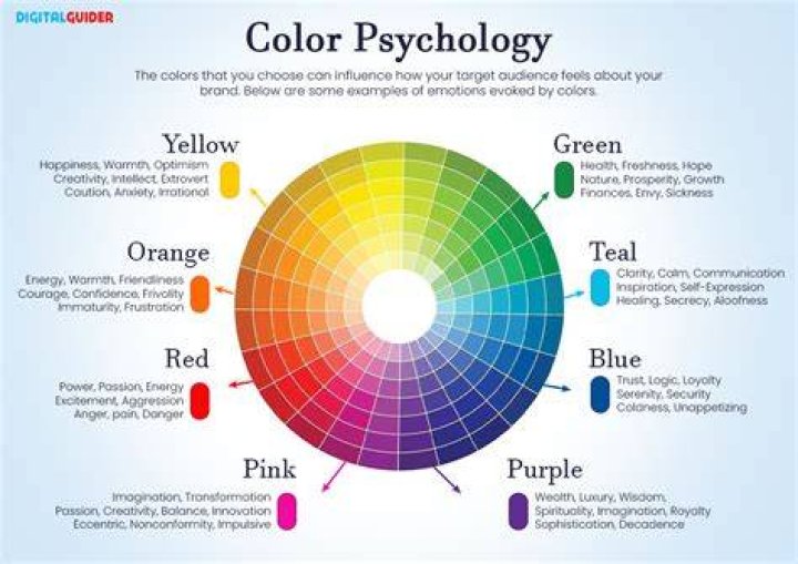
Yellow triggers associations with sunlight, energy, optimism, and warmth. Research in color psychology consistently shows that yellow stimulates mental activity and generates feelings of happiness in many viewers. It's the most visible color in daylight, which explains its use in warning signs, highlighters, and safety equipment. Too much yellow, however, can cause anxiety or overstimulation—a phenomenon designers carefully balance in their work.
Blue evokes calmness, stability, trust, and depth. Studies indicate that blue can lower heart rate and blood pressure, creating a physiologically measurable relaxation response. Corporate brands favor blue precisely because it communicates reliability and professionalism without aggression. The color dominates our visual environment through sky and water, making it the most universally preferred color across cultures.
Pairing yellow and blue creates a dynamic equilibrium. The excitement of yellow gets tempered by blue's serenity. The coldness of blue gains warmth from yellow's presence. This balance makes the combination versatile across contexts—playful in children's products, sophisticated in fine art, authoritative in institutional settings, refreshing in interior design.
Cultural and Historical Significance
Ancient Egyptians prized both colors highly, though they used them differently than we might expect. Egyptian blue, one of the first synthetic pigments, adorned temples and tombs, symbolizing the heavens and the Nile. Yellow represented gold and the eternal, often reserved for depicting gods and royalty. Together, these colors spoke to divine power and cosmic order.
European heraldry and flag design frequently combined yellow (gold) and blue to represent nobility, loyalty, and geographic features. Sweden's flag displays a gold cross on blue. Ukraine's flag places yellow beneath blue to symbolize wheat fields under open sky. These aren't arbitrary choices—they reflect deep cultural associations that resonate with populations across generations.
The Impressionist movement revolutionized how artists used yellow and blue. Vincent van Gogh's "Starry Night" demonstrates the emotional intensity possible when these colors dominate a composition. The painting's swirling blues pulse with movement while yellow stars and moon create focal points of warmth and light. Claude Monet's water lily series explored subtler interactions, where yellow light dances across blue water in endless variations.
Applications in Modern Design and Branding
Contemporary designers exploit yellow and blue's natural contrast for maximum visual impact. IKEA's branding uses these colors to convey Swedish heritage while ensuring instant recognition. The combination reads clearly from long distances and across different media—crucial for a global retail presence. Best Buy employs a similar strategy, though with different proportions and shades to communicate technology and trust.
Web designers face specific challenges with yellow and blue. Yellow text on blue backgrounds (or vice versa) can create readability issues despite high contrast, because the colors vibrate optically at their boundaries. Professional designers typically add white or black outlines, adjust saturation levels, or use one color as an accent rather than splitting the composition evenly.
Interior designers use yellow and blue to manipulate spatial perception and mood. Blue walls recede visually, making rooms feel larger and more tranquil. Yellow accents—pillows, artwork, light fixtures—inject energy without overwhelming the space. The combination works particularly well in kitchens and living areas where activity and relaxation need to coexist.
Natural Occurrences of Yellow and Blue
Nature offers countless examples of this color pairing. Blue jays display vibrant blue plumage with yellow undertones visible in certain lights. Tropical fish species like the blue tang and yellow tang often swim together in reef environments, their contrasting colors serving as both camouflage and communication. Flowers such as irises produce varieties with both yellow and blue petals, attracting pollinators through this high-visibility combination.
The most ubiquitous natural pairing appears overhead daily. Blue skies at sunrise and sunset frame yellow, orange, and gold solar displays. This phenomenon results from Rayleigh scattering—shorter blue wavelengths scatter more easily through atmosphere than longer yellow and red wavelengths. At dawn and dusk, sunlight travels through more atmosphere, allowing yellow wavelengths to dominate while residual blue creates the backdrop.
Bioluminescent organisms sometimes produce blue light, while many flowers and fruits develop yellow pigments for visibility. These combinations serve evolutionary purposes: attracting pollinators, warning predators, or facilitating mating. The colors work precisely because they're so easily distinguished in natural lighting conditions.
Color Theory and Complementary Relationships
On a traditional color wheel, yellow and blue don't sit directly opposite each other—they're not complementary in the strictest sense. True complementary pairs are yellow and violet, or blue and orange. Yet yellow and blue form what color theorists call a "split complementary" relationship, where they share enough contrast to create visual interest without the aggressive tension of true complements.
This relationship makes yellow and blue easier to work with than pure complementary pairs. Designers can use generous amounts of both colors without risking the optical vibration and fatigue that sometimes occur when complements meet at full saturation. The combination remains bold without being harsh, attention-grabbing without being jarring.
When creating color schemes, yellow and blue serve as excellent foundation points. Adding white creates pastels perfect for children's spaces or spring themes. Adding black produces deeper, more sophisticated tones suitable for evening wear or formal settings. Introducing gray allows for countless variations in mood and intensity while maintaining the fundamental yellow-blue relationship.
Frequently Asked Questions
What color do yellow and blue make when mixed?
Yellow and blue create green when mixed as pigments or paints. This occurs through subtractive color mixing, where each pigment absorbs certain wavelengths of light. The only wavelengths both yellow and blue pigments reflect fall in the green range. The exact shade of green depends on the proportions and specific hues of yellow and blue used—more yellow produces yellow-green, while more blue creates blue-green or cyan.
Why do yellow and blue work so well together in design?
Yellow and blue create strong visual contrast because they occupy different positions on both the temperature scale (warm versus cool) and the wavelength spectrum. This contrast makes them highly visible when placed together, ensuring designs read clearly across distances and media. They also balance each other psychologically—yellow's energy pairs with blue's calm, preventing either mood from dominating completely. This versatility explains their popularity across applications from corporate branding to fine art.
Do yellow and blue have different meanings in different cultures?
Yes, cultural context significantly affects color interpretation. In Western cultures, blue typically represents trust, calm, and masculinity, while yellow suggests happiness, caution, or cowardice depending on context. Eastern cultures may view yellow as representing royalty, prosperity, or sacredness. Blue holds religious significance in Judaism and Christianity. However, the basic perceptual qualities—blue's coolness, yellow's brightness—remain consistent across cultures because they're rooted in human biology and shared environmental experiences like sky and sun.
The Enduring Appeal of Yellow and Blue
Few color combinations match yellow and blue for sheer versatility and recognizability. They appear in some of humanity's earliest art and remain central to contemporary visual culture. This staying power stems from multiple factors working in concert: strong perceptual contrast, balanced psychological effects, rich cultural associations, and abundant natural precedents.
Whether you're selecting paint colors for a room, designing a logo, composing a photograph, or simply noticing the world around you, understanding how yellow and blue interact enhances your ability to use color effectively. These two hues offer a masterclass in how simple elements—wavelengths of light—can generate complex meanings, emotions, and responses when they meet in the space between our eyes and our understanding.
