What Does Orange and Purple Make? A Complete Color Mixing Guide
 Matthew Shields
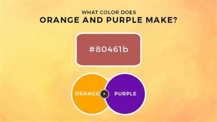
When orange and purple collide on your palette, the result might surprise you. These two vibrant colors create a muddy brown or russet tone that leans toward terra cotta, depending on the proportions you use. The exact outcome varies based on the specific shades you're mixing, the medium you're working with, and whether you're combining pigments or light.
Understanding what orange and purple make requires a quick dive into color theory. These colors sit opposite each other on the color wheel, making them complementary pairs. Red sits between them, which explains why their mixture tends toward brownish hues rather than creating something bright and saturated. Artists, designers, and anyone working with color can benefit from knowing how these combinations behave.
The Science Behind Mixing Orange and Purple
Orange contains red and yellow. Purple contains red and blue. When you mix orange and purple together, you're essentially combining all three primary colors: red, yellow, and blue. This trio creates what color theorists call a tertiary neutral.
The red component appears in both colors, which intensifies that particular wavelength in the mixture. Yellow from the orange and blue from the purple partially cancel each other out, being near-opposites on the spectrum. What remains is a muted, earthy tone that can range from reddish brown to a burnt sienna, depending on which color dominates the mix.
In paint mixing, the ratios matter significantly. More orange pushes the result toward rust or terra cotta. More purple shifts it toward a cooler, grayed-down plum brown. Equal parts typically yield a neutral brown with slight warmth.
Different Mixing Scenarios and Results
The medium you're using changes everything. Watercolors behave differently than acrylics, which behave differently than oils, which behave differently than digital color mixing.
With paint, you're dealing with subtractive color mixing. Pigments absorb certain wavelengths of light and reflect others. Each pigment you add removes more wavelengths from what gets reflected back to your eye. That's why mixing more colors together tends to muddy them rather than brighten them.
Digital screens use additive color mixing with light. When you mix orange and purple in programs like Photoshop or Procreate using RGB values, you might get slightly different results than with physical paint. The screen combines light wavelengths rather than subtracting them through pigment absorption.
In light mixing, orange and purple still neutralize each other somewhat, but the result appears brighter than it would with paint because light adds luminosity rather than absorbing it.
Practical Applications in Art and Design
Professional artists rarely mix orange and purple by accident. They do it intentionally to create sophisticated neutrals that have more life than colors straight from a tube labeled "brown."
Portrait painters use orange-purple mixtures for realistic skin shadows. The slight coolness from the purple prevents shadows from looking flat or dead, while the orange keeps them warm enough to appear natural. This technique appears in works by masters from Rembrandt to contemporary realists.
Interior designers employ this color relationship when choosing accent pieces. A room with orange walls might feature purple textiles, and where they visually overlap in a person's perception, the space gains depth. The complementary relationship creates visual interest without clashing.
Sunset photography often captures natural orange-purple combinations. The warm orange near the horizon transitions to cool purple higher in the sky, with the transition zones showing exactly what happens when these colors meet: rich, complex browns and mauves that photographers spend careers trying to capture perfectly.
Understanding Complementary Colors
Orange and purple's relationship as complementary colors explains their mixing behavior. Complementary pairs sit opposite each other on the traditional color wheel. When placed side by side, they make each other appear more vibrant through simultaneous contrast.
But mixed together? They neutralize. This principle applies to all complementary pairs: red and green, blue and orange, yellow and purple. The mixture always trends toward brown or gray because you're combining wavelengths that essentially cancel each other's saturation.
Artists exploit this property strategically. Need to tone down a too-bright orange? Add a touch of purple. Want to gray out a screaming purple? Mix in some orange. This approach creates more harmonious neutrals than adding black or white, which can deaden colors entirely.
Variables That Affect the Final Color
Not all oranges are created equal, and neither are purples. A red-orange (vermillion) behaves differently than a yellow-orange (cadmium orange light). A blue-purple (ultramarine violet) creates different mixtures than a red-purple (magenta).
Paint quality matters too. Student-grade paints contain less pigment and more filler, which affects mixing predictability. Professional-grade paints with higher pigment loads create cleaner, more predictable mixtures.
The painting surface influences results as well. Absorbent papers pull pigment differently than primed canvas. Smooth surfaces allow colors to blend more thoroughly than textured ones, where pigments can sit in separate peaks and valleys.
Lighting conditions change how we perceive mixed colors. The same orange-purple mixture looks warmer under incandescent light, cooler under fluorescent tubes, and most accurate under natural daylight. Professional colorists always check their work under multiple light sources before finalizing choices.
Creating Specific Shades and Tints
You can steer orange-purple mixtures toward specific colors with small adjustments. Adding white creates a dusty rose or mauve. Adding black produces deep chocolate browns. Introducing more yellow shifts the mixture toward sienna or ochre territory.
For warmer results, start with a red-leaning orange and a red-leaning purple (like magenta). This keeps more red in the final mixture and prevents it from cooling too much toward gray-brown.
Cooler results come from yellow-orange mixed with blue-purple. The increased yellow-blue interaction pushes the mixture toward olive or khaki browns with less red presence.
Transparency also plays a role. Transparent pigments mixed together look different than opaque ones because light passes through transparent layers and bounces back from the surface underneath, creating optical mixing effects that change the perceived color.
Common Mistakes When Mixing These Colors
Beginning artists often add too much of one color trying to "fix" a mixture, then overcompensate by adding too much of the other. This cycle wastes paint and creates increasingly muddy results. Start with small amounts and build gradually.
Another mistake is expecting a bright, saturated result. Orange and purple won't create a vibrant new hue. They're complementary, designed by their position on the color wheel to neutralize each other. Understanding this prevents disappointment.
Using dirty brushes or palettes introduces unwanted colors into your mixture. That tiny bit of green left on your brush from earlier will affect how your orange and purple combine. Clean tools ensure predictable results.
Forgetting to test mixtures before applying them to your final piece causes problems. Always test on scrap paper or canvas first. Colors look different when wet versus dry, especially with acrylics and watercolors, and the amount of white canvas showing through affects perceived color intensity.
Historical Use in Art and Culture
Renaissance painters understood color mixing intuitively long before modern color theory codified the principles. They created rich, complex browns for backgrounds and shadows by mixing complementary colors rather than using straight brown pigment, which often appeared flat and lifeless.
The Impressionists took this further, placing complementary colors side by side in small strokes rather than mixing them on the palette. Viewed from a distance, the eye blends the colors optically. Orange and purple feature prominently in works by Monet, Renoir, and van Gogh for exactly this reason.
Victorian-era color theorists obsessed over complementary relationships. Michel Eugène Chevreul's work on simultaneous contrast influenced not just painters but also textile designers, who used orange and purple combinations in elaborate tapestries and carpets.
Frequently Asked Questions
What exact shade of brown do orange and purple create?
The specific shade depends on your starting colors and their proportions. Generally, you'll get a reddish brown, russet, or terra cotta color. Equal parts of pure orange and pure purple typically yield a medium warm brown. More orange creates rust tones, while more purple produces cooler, grayer browns. The exact result also varies by medium—paint, digital, or light-based mixing all produce slightly different outcomes.
Can you make orange and purple brighter by mixing them together?
No. Orange and purple are complementary colors, meaning they neutralize each other when mixed. Instead of creating something brighter or more saturated, they produce muted, earthy tones. To make either color appear brighter, place them next to each other without mixing. The contrast makes each color look more vibrant through an optical effect called simultaneous contrast.
How do I fix an orange-purple mixture that looks too muddy?
If your mixture looks muddier than intended, you've likely over-mixed or used too much of both colors. Try adding more of whichever color you want to dominate—more orange for warmer browns, more purple for cooler tones. You can also add a small amount of white to lighten and clarify the mixture, though this reduces saturation. Starting fresh with smaller amounts of paint often works better than trying to salvage an already-muddy mixture.
Does mixing orange and purple work the same way in digital design?
Digital color mixing uses light (additive) rather than pigment (subtractive), so results differ slightly from traditional paint mixing. In RGB color models, mixing orange and purple still produces brownish tones, but they may appear slightly brighter or different in hue compared to physical paint. Digital designers should test their specific software's color mixing behavior. Color values in hex codes or RGB numbers won't translate directly to paint equivalents.
What colors should I use to make a clean orange or purple instead?
For clean orange, mix red and yellow—two primary colors that create a secondary color without neutralizing. For purple, mix red and blue. Avoid adding complementary colors if you want maximum saturation. When you need to adjust these colors, add small amounts of their neighbors on the color wheel (yellow for yellow-orange, red for red-orange) rather than their complements, which will gray them out.
Final Thoughts
Mixing orange and purple creates earthy browns and russets rather than bright new colors. This happens because they're complementary colors that neutralize each other, combining all three primary colors in one mixture. The exact result depends on your specific shades, proportions, and medium.
Whether you're painting, designing, or simply curious about color behavior, understanding how orange and purple interact gives you better control over your creative work. Professional artists use these neutralized complementary mixtures to create sophisticated, harmonious palettes that feel more natural than colors used straight from the tube. The key is experimentation—test your mixtures, keep notes on what works, and remember that the "muddy" browns from complementary pairs often have more visual interest than any single pigment could provide on its own.